

Real estate agency
33 Reality
A real estate agency logo in which a roof is hidden between the digits 33.
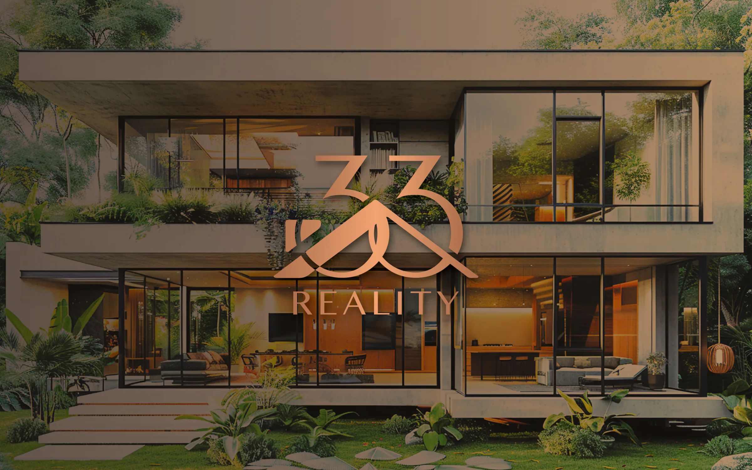
How we created a stylish real estate brand
For 33 Reality, a real estate agency operating in western Slovakia, we created a complete visual identity that reflects its market position and the high standard of its services. Our work included designing a unique logo and the entire graphic concept, adapted to a luxurious style to emphasise the prestige and reliability of the brand.
Logo design
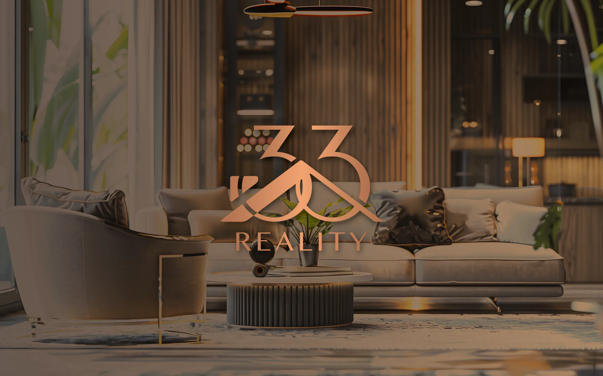
The 33 Reality logo is sophisticated and elegant, reflecting the values of a company focused on reliability and professionalism in real estate. The design contains two key elements:
The number "33": the numerals are modern and flowing, symbolising the company's dynamism and growth on the market. Soft curves and the connection between the digits suggest linked services and a personal approach to clients.
Roof symbolism: a roof symbol is elegantly worked in between the two numerals, clearly communicating the company's field: real estate and property.
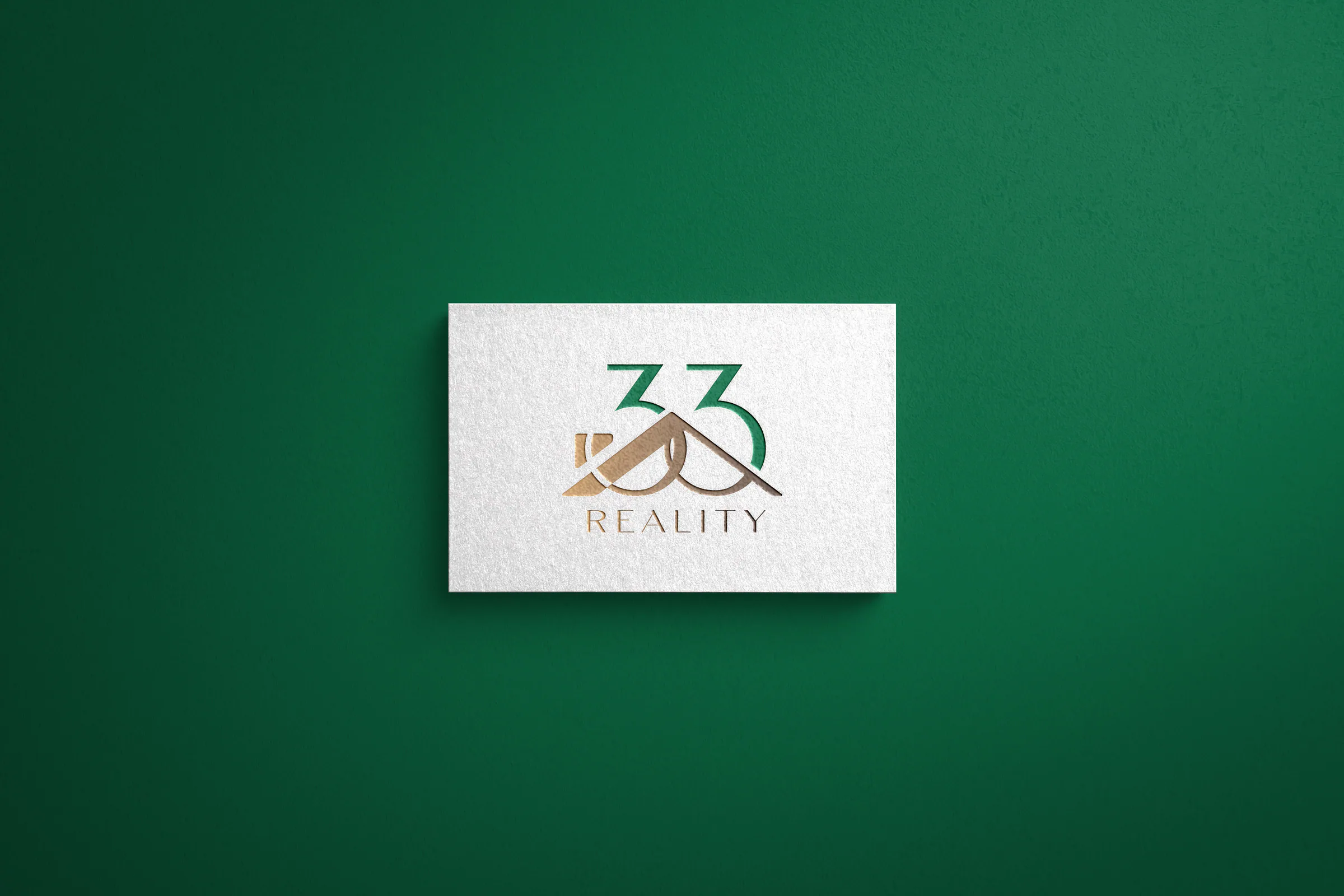
The logo's colour palette combines gold and green shades, joining prestige and trustworthiness with a modern, eco-friendly touch.
Gold reflects stability and luxury, while green evokes the environment and sustainability.
The overall execution is clean and aesthetically appealing, making the brand memorable and giving clients a sense of trust and professionalism.
What we created
- 01
Logo
Flowing digits 33 with a roof symbol, in gold and green shades.
- 02
Graphic concept
A visual style tailored to the luxury segment.
Next step
Tell us where you want to go. We will plan the route together.
The first consultation is free and without obligation. We go through your goals, and afterwards you receive a proposed solution with an indicative price.
Start my project