

Premium wine from Tuscany
The Cavalier
A complete wine brand, from the name and a hand-drawn horse illustration through the label, packaging and wax seal to the website and export strategy.
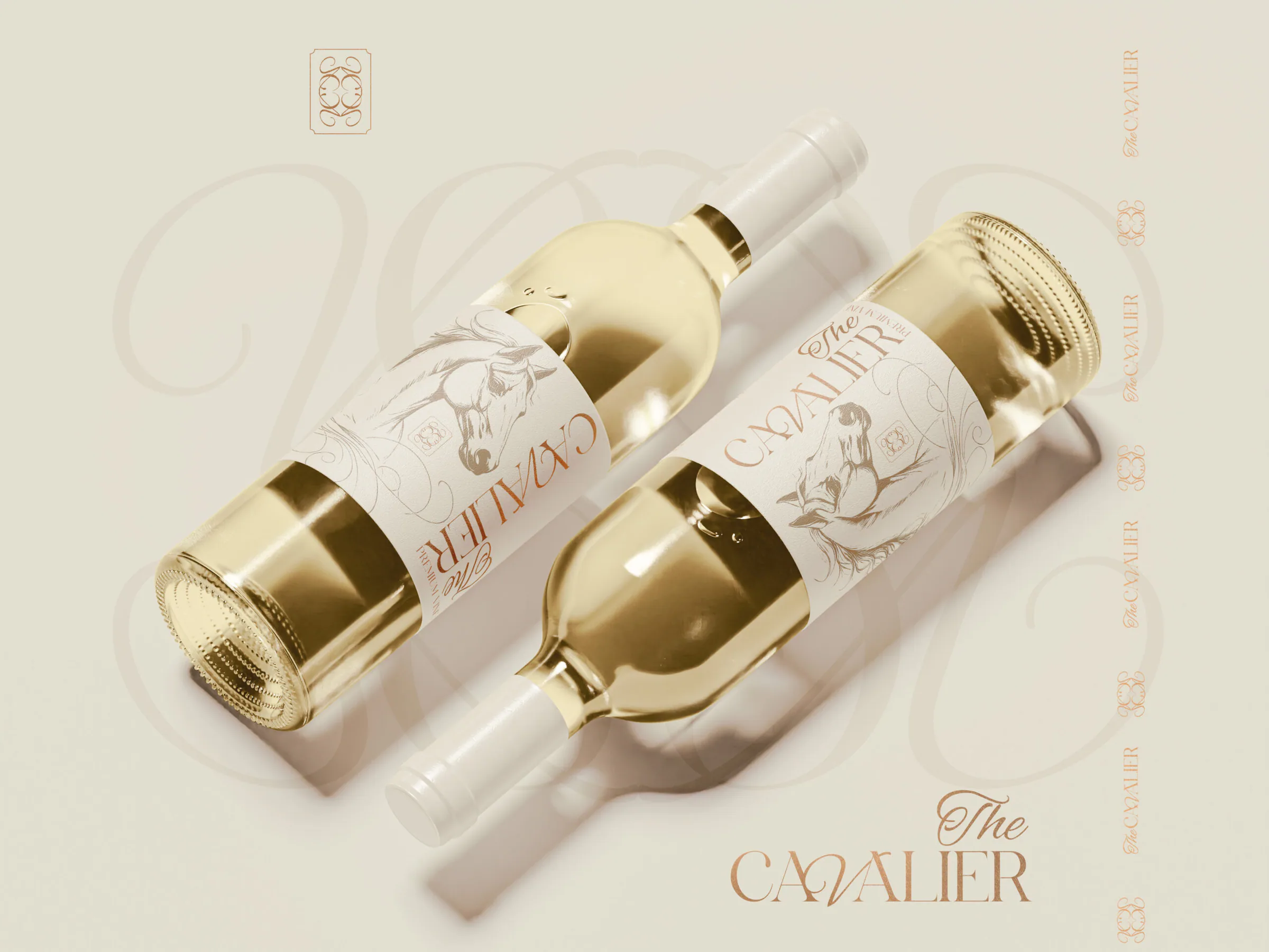
The Cavalier
A premium wine from Tuscany that combines luxury, tradition and modern design.
At ReVisual we created complete branding for The Cavalier, from the name, symbolism and visual identity to a custom website design that underlines the elegance of the brand and the character of the wine.
Our task
The aim was to create a brand that looks elegant, authentic and premium at first glance, with the potential to stand out on the international market.
We focused on building a strong story, visual harmony and a technically high-quality website.
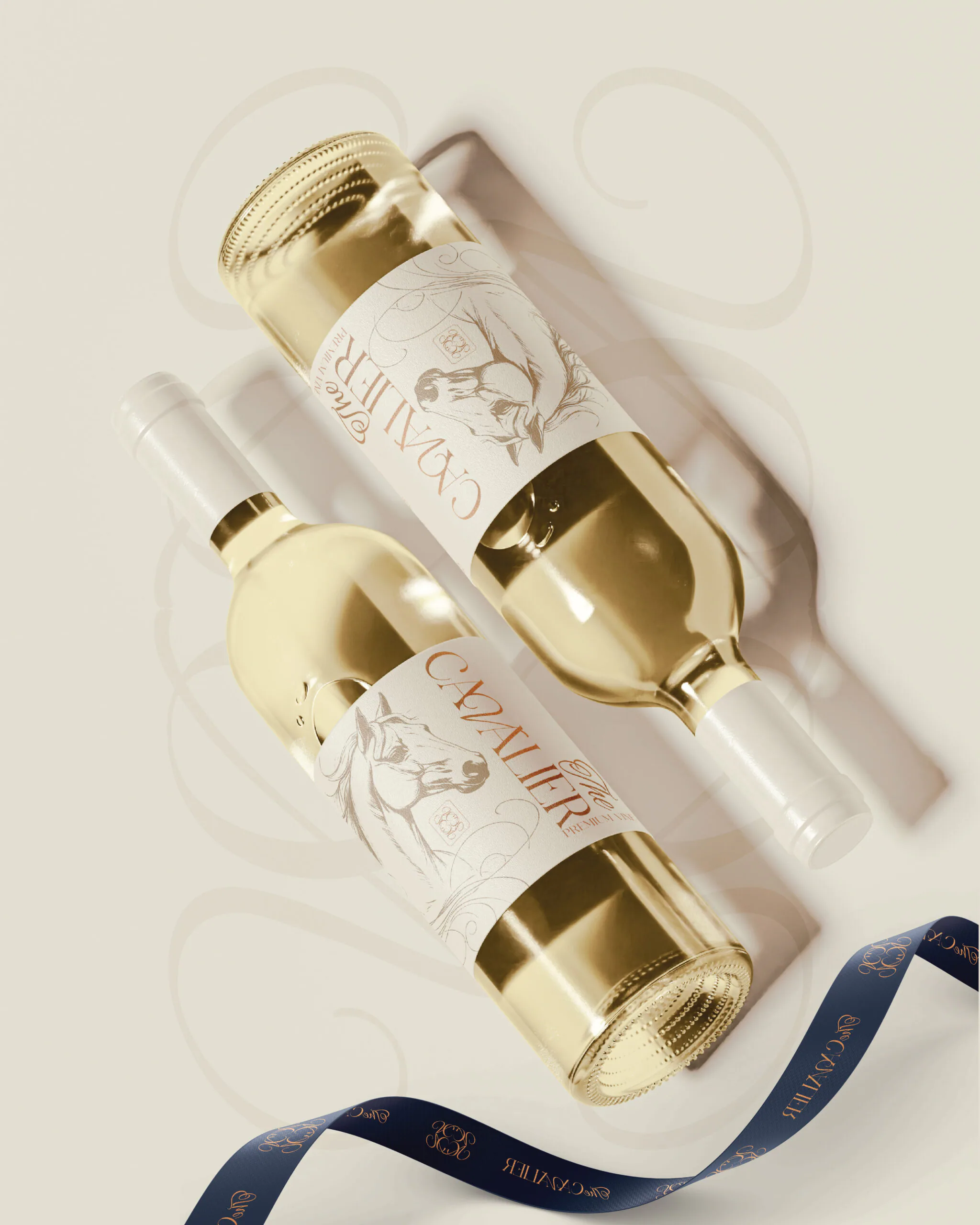
What we created:
Naming and brand story: choosing the name The Cavalier, symbolising nobility, strength and aristocratic elegance. Logo and visual identity: a hand-drawn horse illustration, elegant typography, a premium colour palette and symbolic patterns. Custom web design: a modern, fast and SEO-optimised website with an emphasis on user experience, detail and the brand story. Label and packaging: a minimalist, luxurious design with gold details and branded elements.
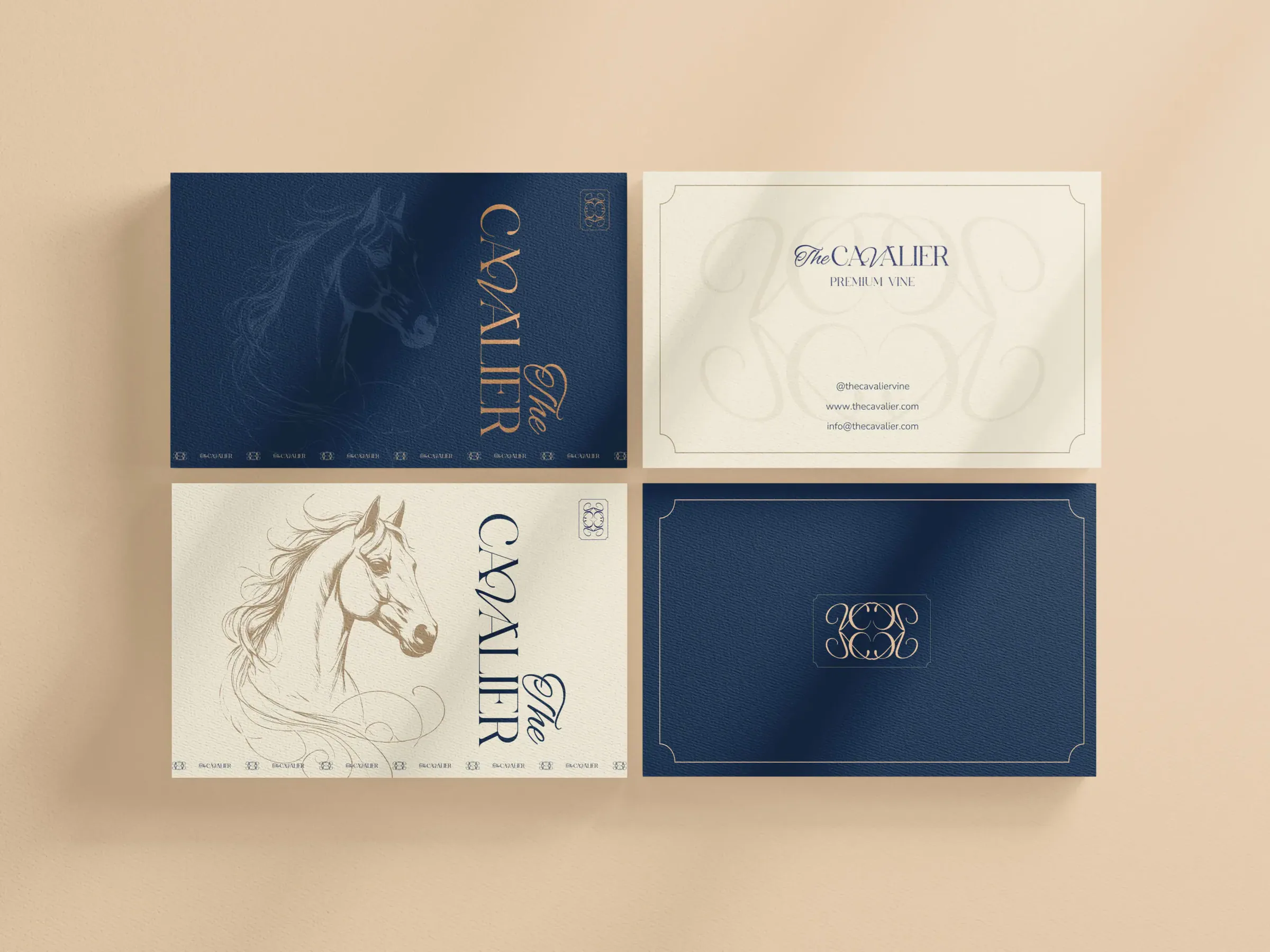
Marketing materials, business cards, a ribbon, a wax seal and consistent visual communication.
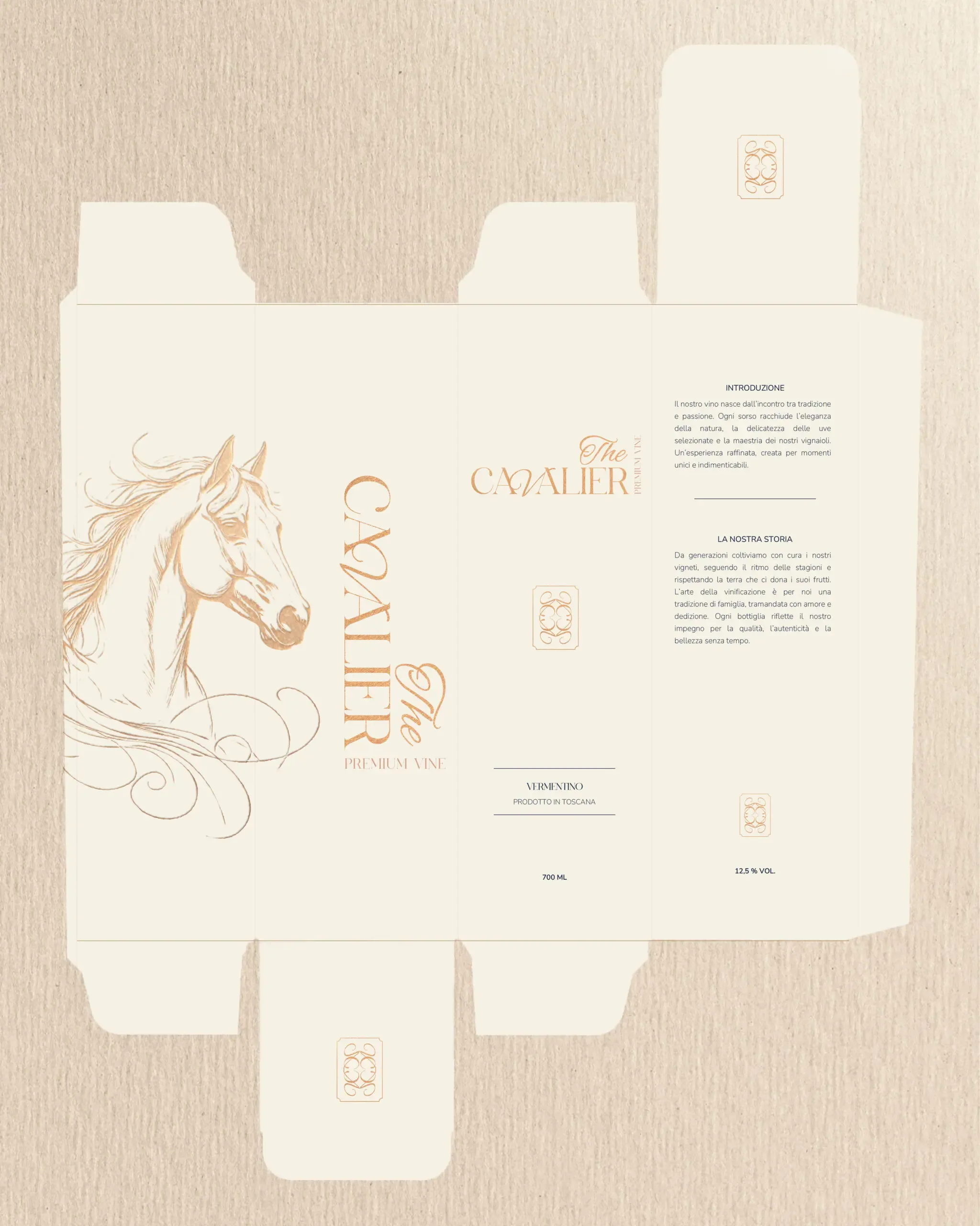
Copywriting: Italian label copy (Intro and La Nostra Storia) telling the story of origin and tradition.
Strategic plan: target audience definition, export strategy and communication concept.
The Cavalier is not just a wine; it is an experience. A brand that tells the story of Tuscany, nobility and timeless elegance.
Case study
Wine is not just a drink; it is a symbol of culture, tradition and refinement.
The Cavalier is a premium wine brand that combines the Italian winemaking tradition with the modern elegance of branding.
The aim was to create a wine whose look and story express nobility, strength and beauty, while being ready to compete on the international market.
Naming and brand identity
The challenge: to find a name that sets the brand apart from the competition and feels luxurious, memorable and international.
The solution:
We chose the name The Cavalier, a reference to the aristocratic horseman, a symbol of courage, elegance and honour.
The name reads well globally and is easy to pronounce in many languages.
The link with the horse symbol: the horse stands for strength, elegance and freedom; the cavalier for nobility, protection and tradition.
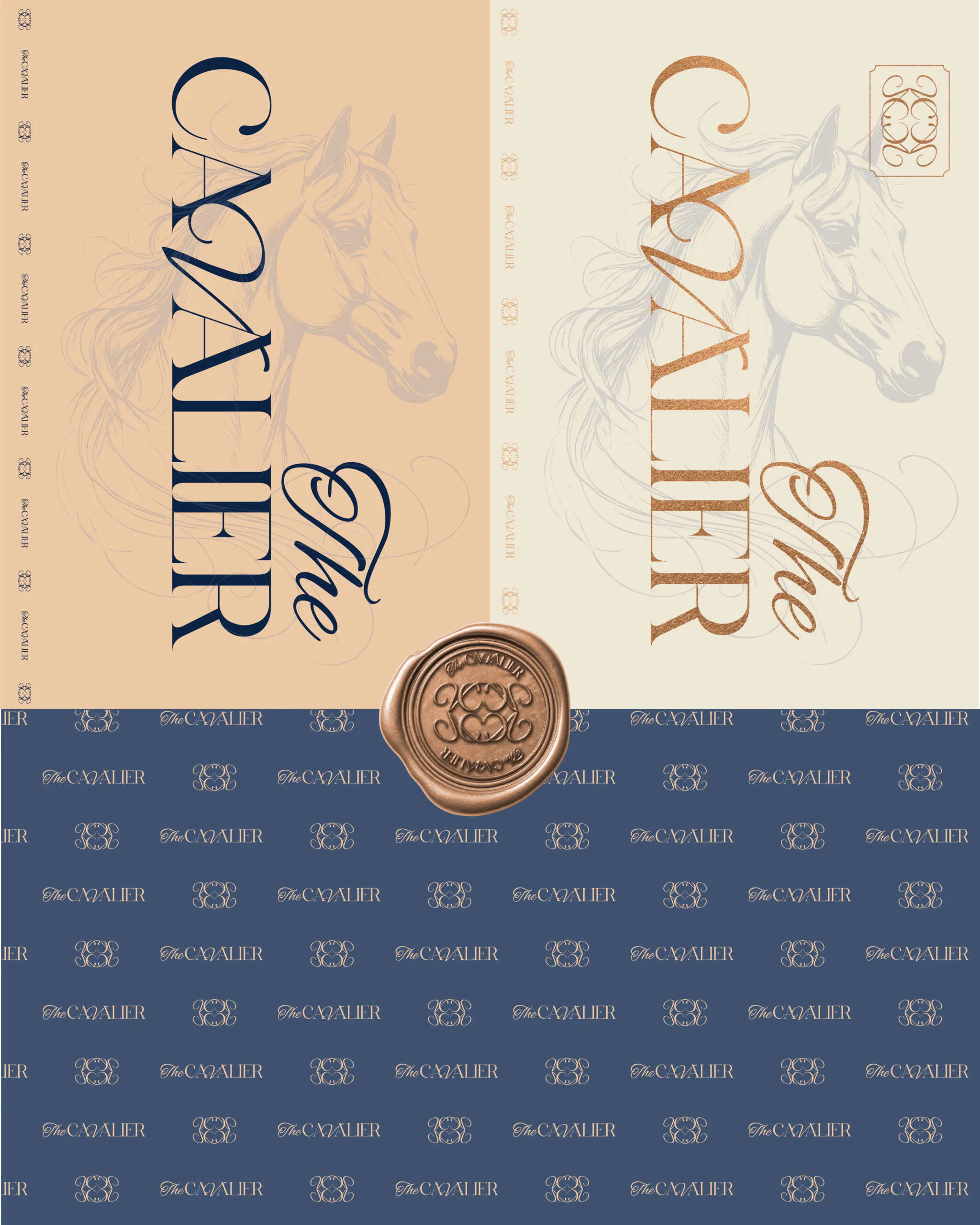
The horse as a symbol: strength, elegance, freedom. The cavalier: nobility, protection, tradition.
Brand positioning:
A premium wine category for customers looking for an exceptional product.
It combines the authenticity of Tuscany with sophisticated modern visuals.
Visual identity
The goal: to create a visual language that immediately communicates luxury and refinement.
Key elements:
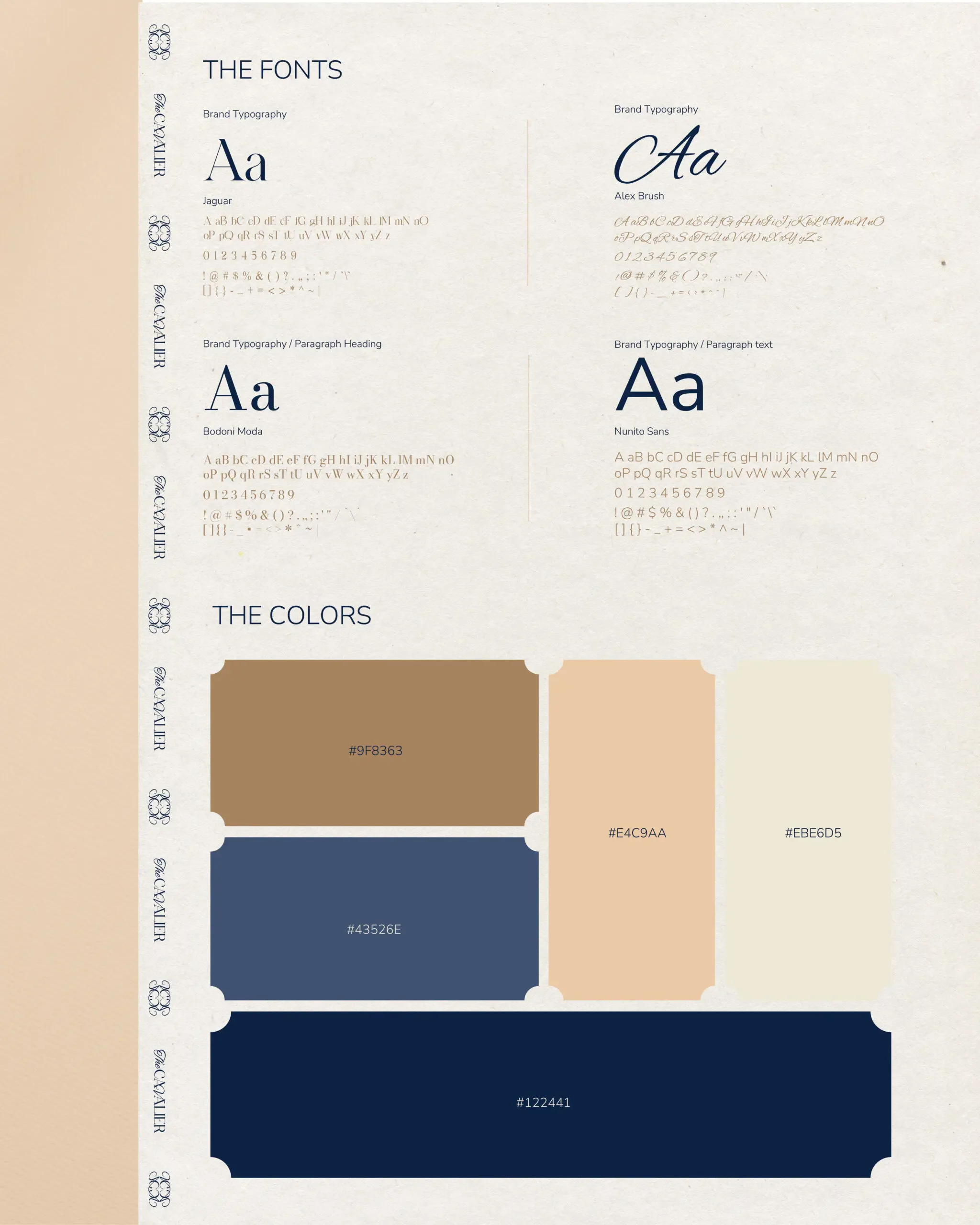
Logo and typography: an elegant combination of serif typefaces (Bodoni Moda, Jaguar) and calligraphic details (Alex Brush). Serif stands for tradition, calligraphy for finesse.
Colour palette: beige (#EBE6D5) and gold (#9FB363) for refinement, royal navy (#122441, #43526E) for elegance and stability.
Symbol: a minimalist pencil-drawn horse illustration with clean lines and a wavy mane and tail for a sense of gentle movement.
Pattern: ornamental lines derived from the horse's mane, used as a background and decorative element.
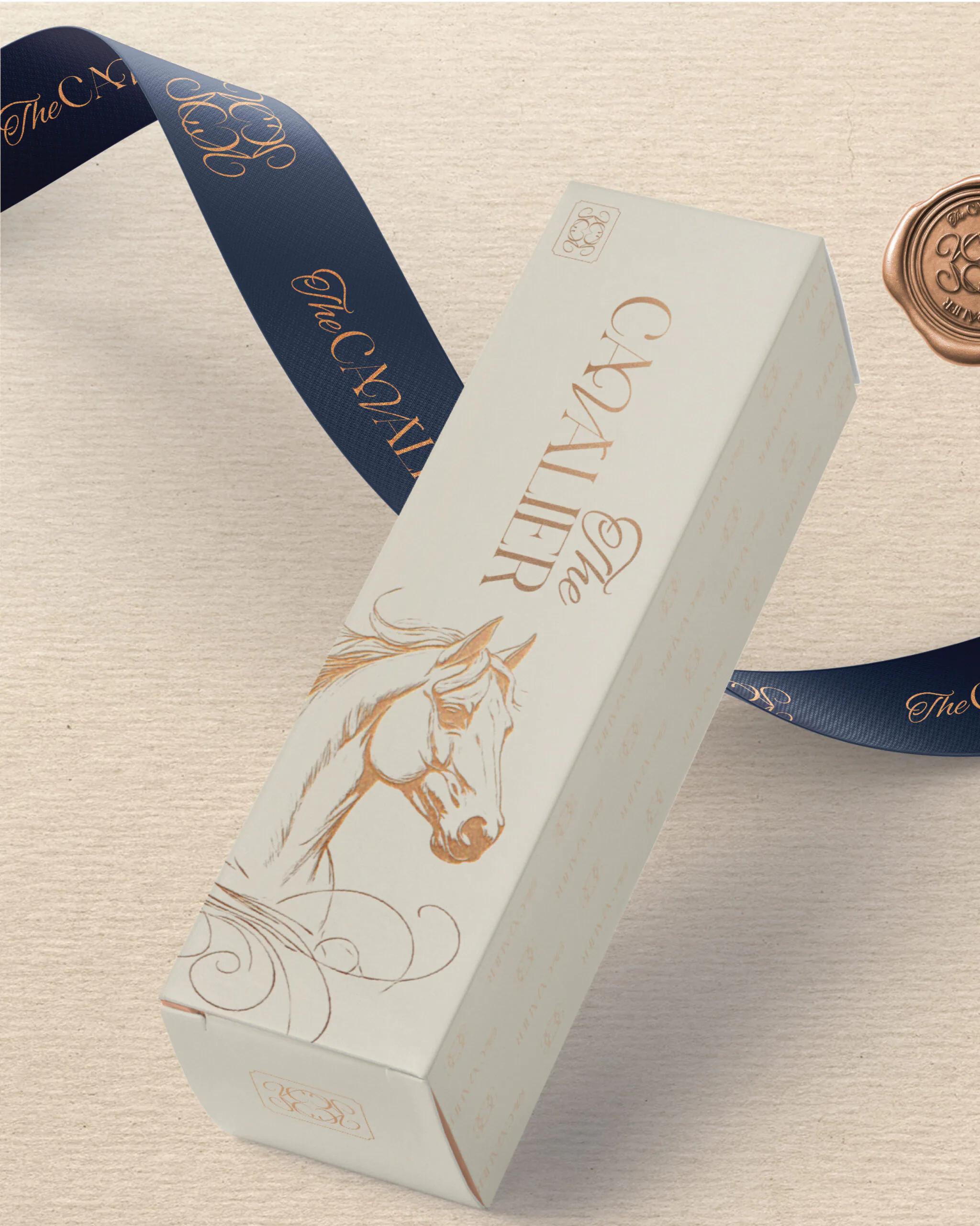
Details: a wax seal, a branded ribbon and luxury boxes.
Product and origin
Variety: Vernaccia di San Gimignano DOCG, one of the most prestigious white wines of Tuscany.
Alcohol: 12.5% vol.
Volume: 750 ml.
Region: Toscana, Italia.
Marketing strategy
Target audience
Wine lovers aged 30 to 55 who appreciate a premium lifestyle.
Fine dining restaurants, hotels and wine shops.
Export: Europe (Germany, Austria, Czech Republic, Slovakia) and luxury markets (Dubai, London, Paris).
Distribution
Limited editions with numbered bottles.
Premium gift packaging (wood, leather, magnetic boxes).
An online shop and partner wine shops.
Communication
Slogan: The Cavalier, L’eleganza della Toscana.
Storytelling: wine as a symbol of aristocratic tradition and refinement.
Content: visually strong campaigns (horse symbolism, Tuscan vineyards, label details).
Social media: Instagram for lifestyle and visual aesthetics; Facebook for communicating with wine communities; LinkedIn for business partners.
PR and events: tastings, collaborations with hotels and chefs, premium tasting nights.
Sales strategy
Premium pricing in line with the DOCG category.
A limited number of bottles per year for exclusivity.
Sales bundles (2 to 3 bottles, mixed sets).
Final branding and product
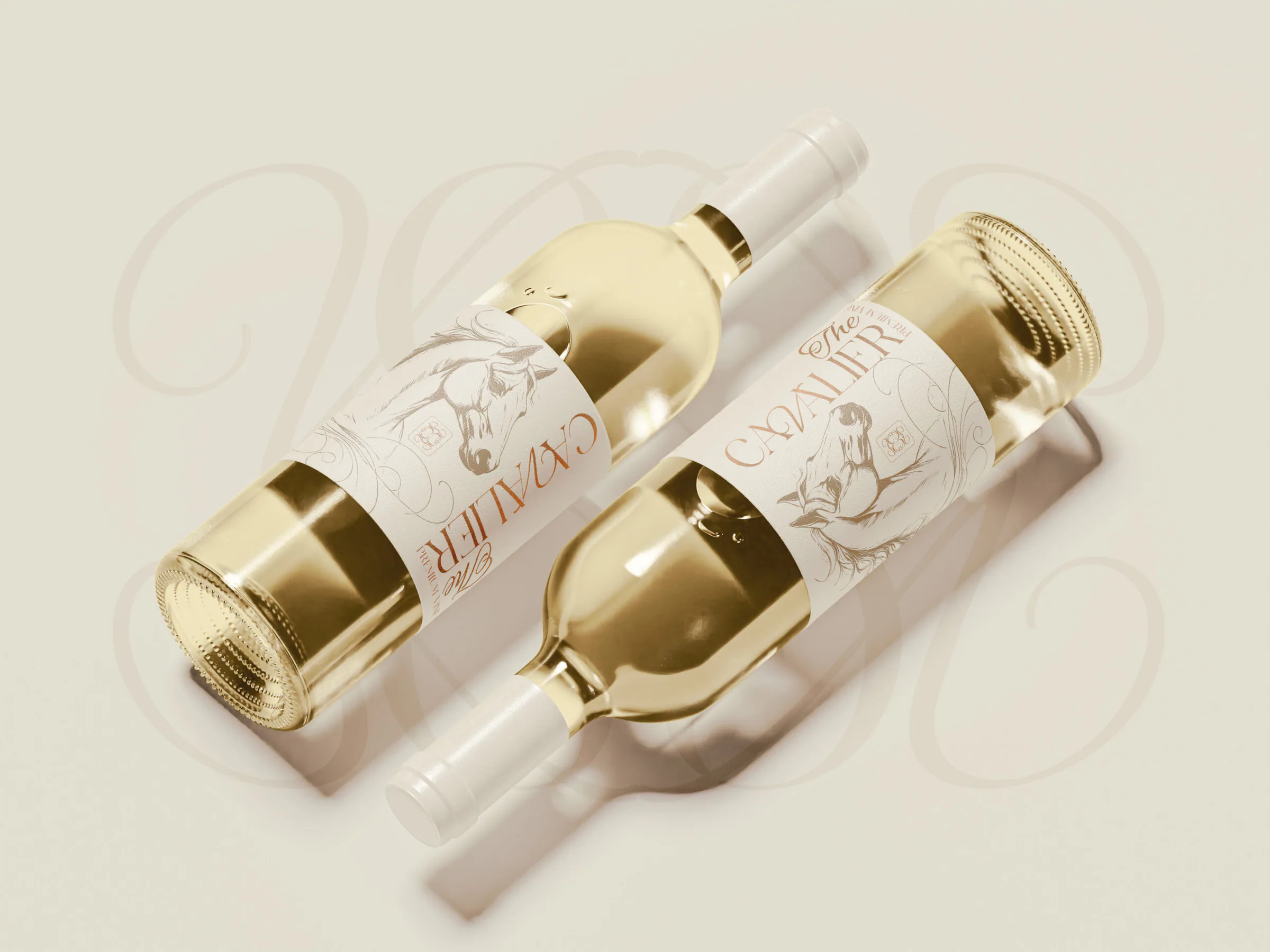
Label: a minimalist horse drawing, luxurious typography and gold details.
Packaging: a premium box with an illustration, a subtle pattern and gold print.
Business cards and print: an elegant combination of navy and gold with consistent details.
Accessories: the wax seal and ribbon add authenticity and a luxurious character.
Bottle: white wine with a white closure; the label looks noble, clean and premium.
The effect: The Cavalier comes across as a wine for celebrations and special moments, representing the refinement of Tuscany.
Conclusion
The Cavalier is a showcase of how a brand can be created from the name, through the visual identity, to the final sales strategy.
Customers perceive the wine as a luxury product with a story.
The branding sets it apart from the competition and moves it into the lifestyle wine category.
The project is ready for export and premium presentation on the international market.
What we created
- 01
Naming and brand story
The name The Cavalier stands for nobility, strength and aristocratic elegance.
- 02
Logo and identity
A hand-drawn horse illustration, elegant typography, a premium palette and symbolic patterns.
- 03
Label and packaging
A minimalist label with gold details, a box, ribbon and wax seal.
- 04
Website and copy
Custom web design and Italian label copy (Intro and La Nostra Storia).
- 05
Strategy
Target audience definition, export strategy and communication concept.
Next step
Tell us where you want to go. We will plan the route together.
The first consultation is free and without obligation. We go through your goals, and afterwards you receive a proposed solution with an indicative price.
Start my project