
Chocolate maker
VIŠŇA
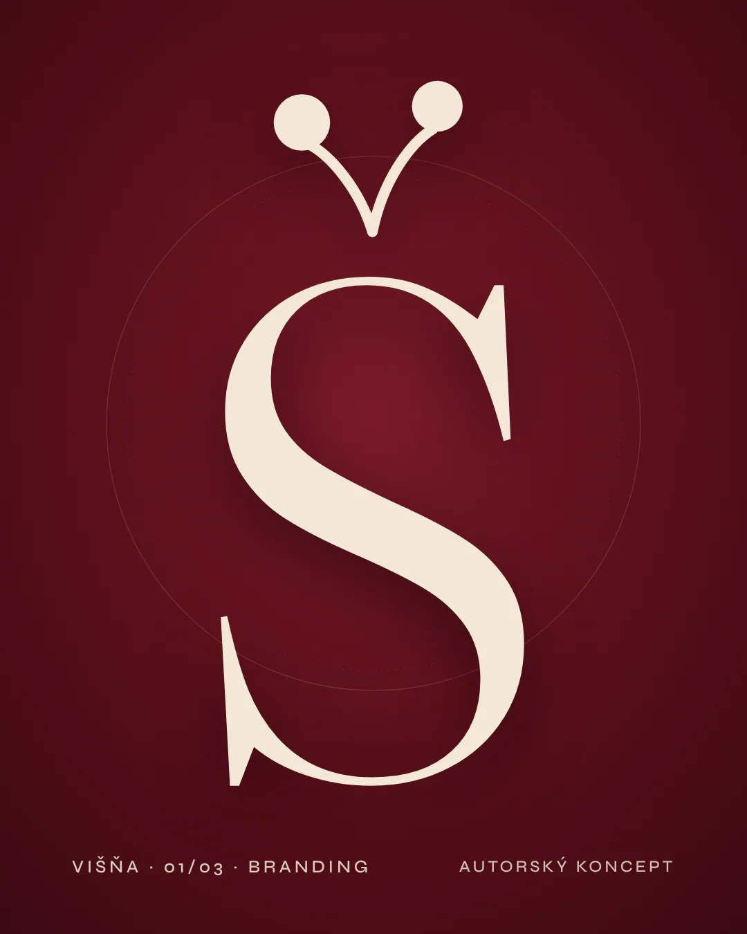
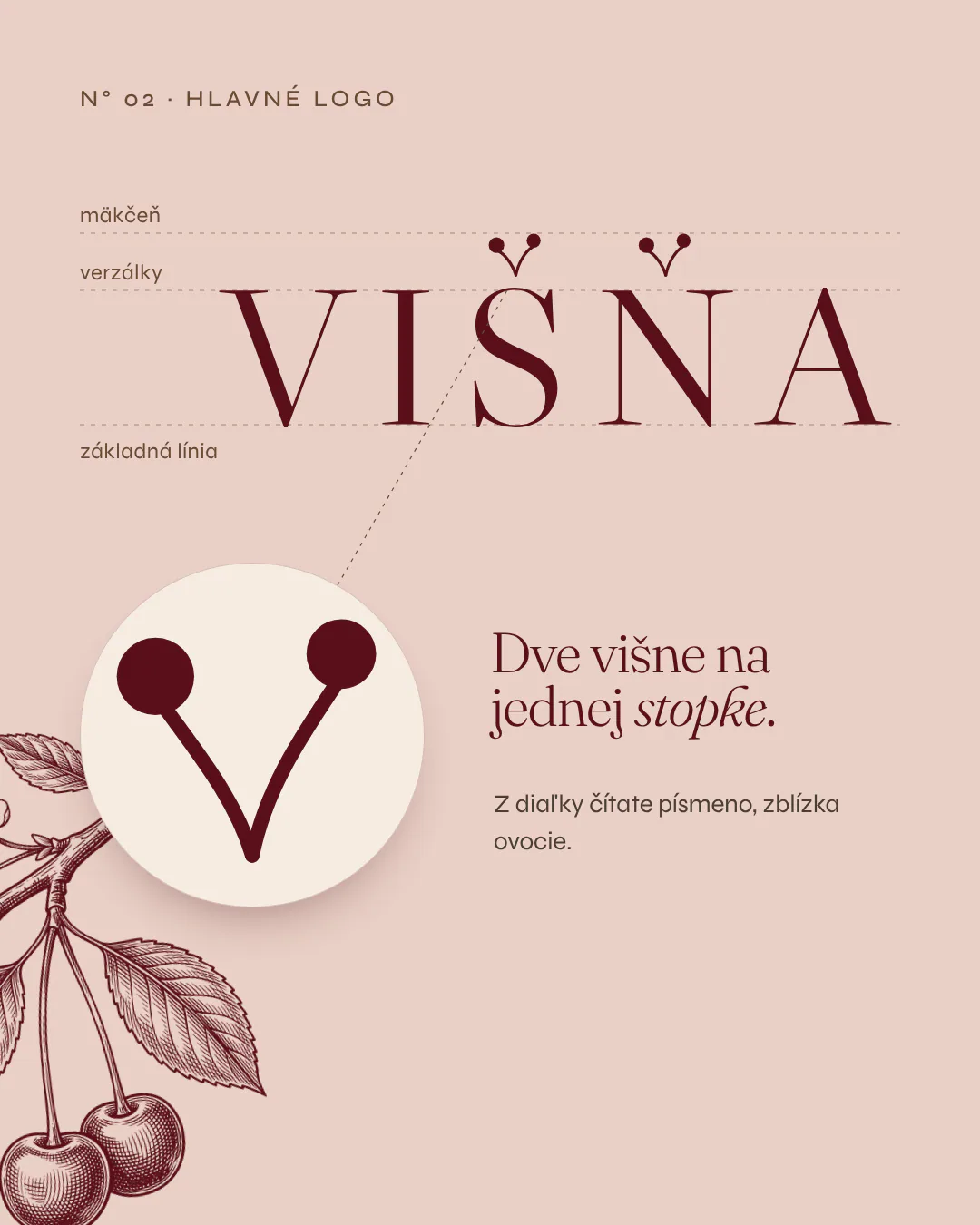
A chocolate maker with the taste of ripe fruit: a logo where the háček above Š became two cherries on one stem, a full identity, a website design and packaging.
Context
VIŠŇA (Slovak for sour cherry) is a fictional chocolate maker we designed in the studio. It shows how a whole brand grows from a single mark, from the seal to the website. The devices, packaging and shop on this page are visualisations.
Goal
To design a brand that feels like a gift: at the shop counter, in the hand and on the website, with one mark and clear colours for each flavour.
What we created
- 01
Logo and mark
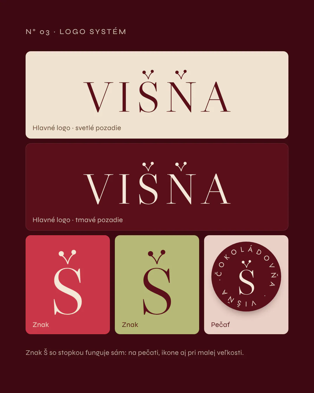
VIŠŇA wordmark, the Š mark with a háček made of two cherries, versions for light and dark backgrounds and a round seal.
- 02
Typefaces
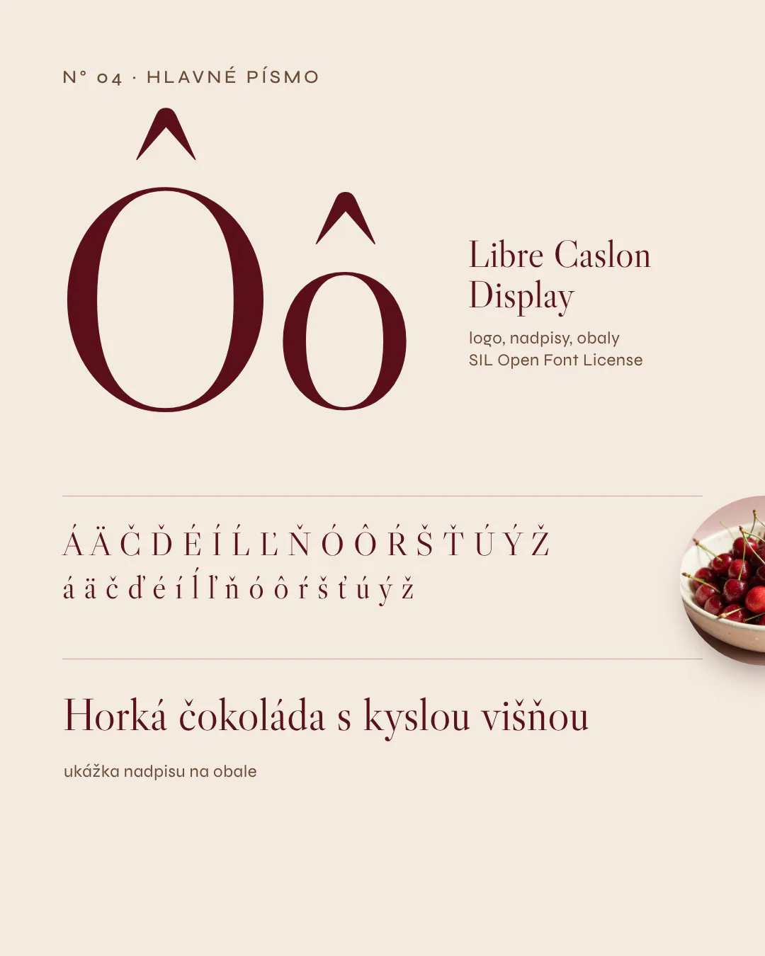
Libre Caslon Display for the logo and headings, Jost for text and packaging. Both support Slovak characters.
- 03
Colours
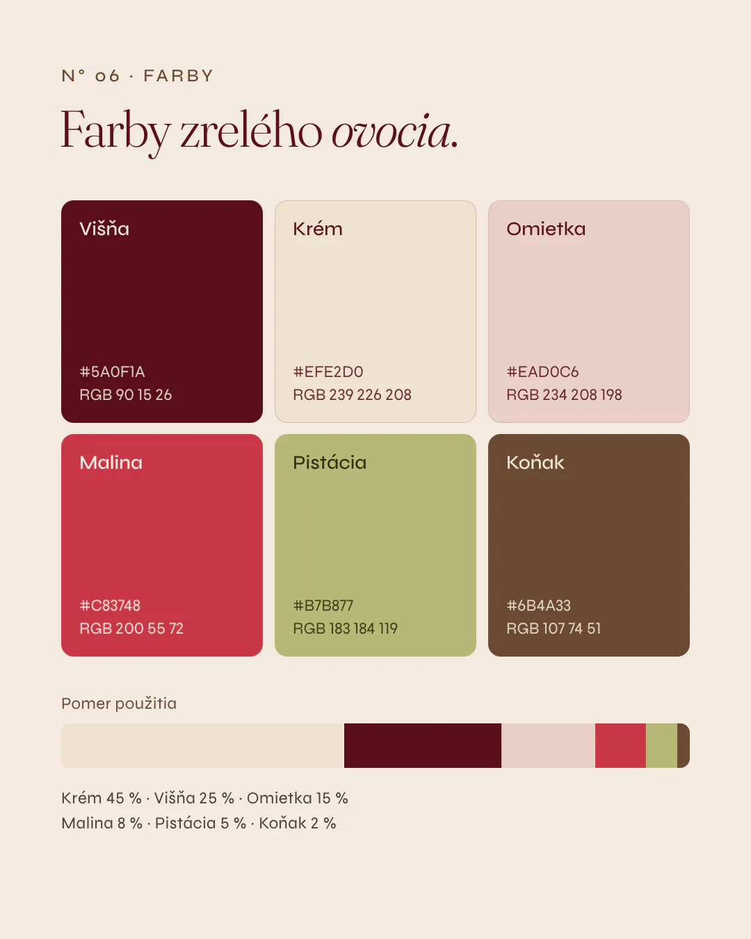
Six colours of ripe fruit and the shop: Cherry, Cream, Plaster, Raspberry, Pistachio and Cognac, with usage ratios.
- 04
Website design
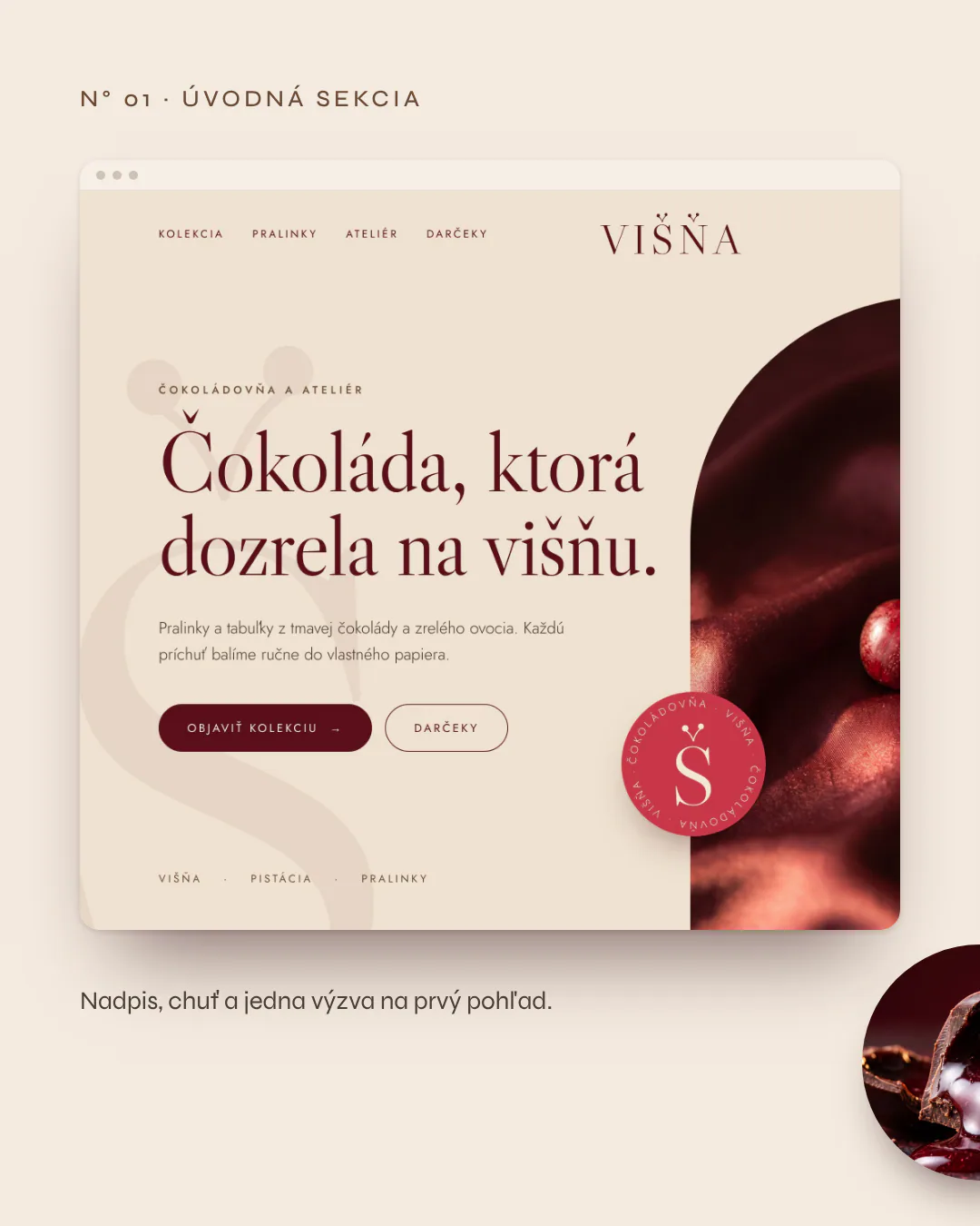
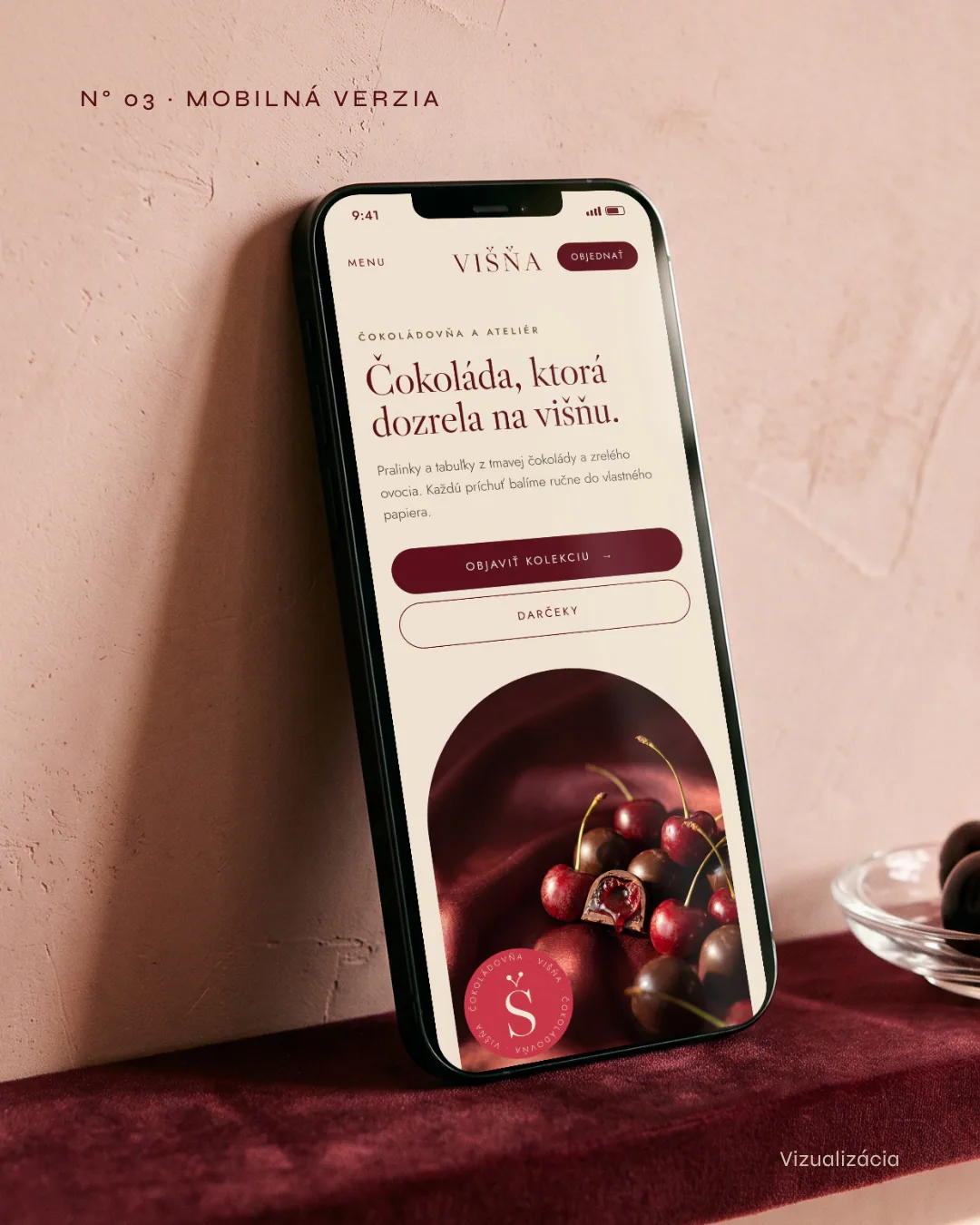
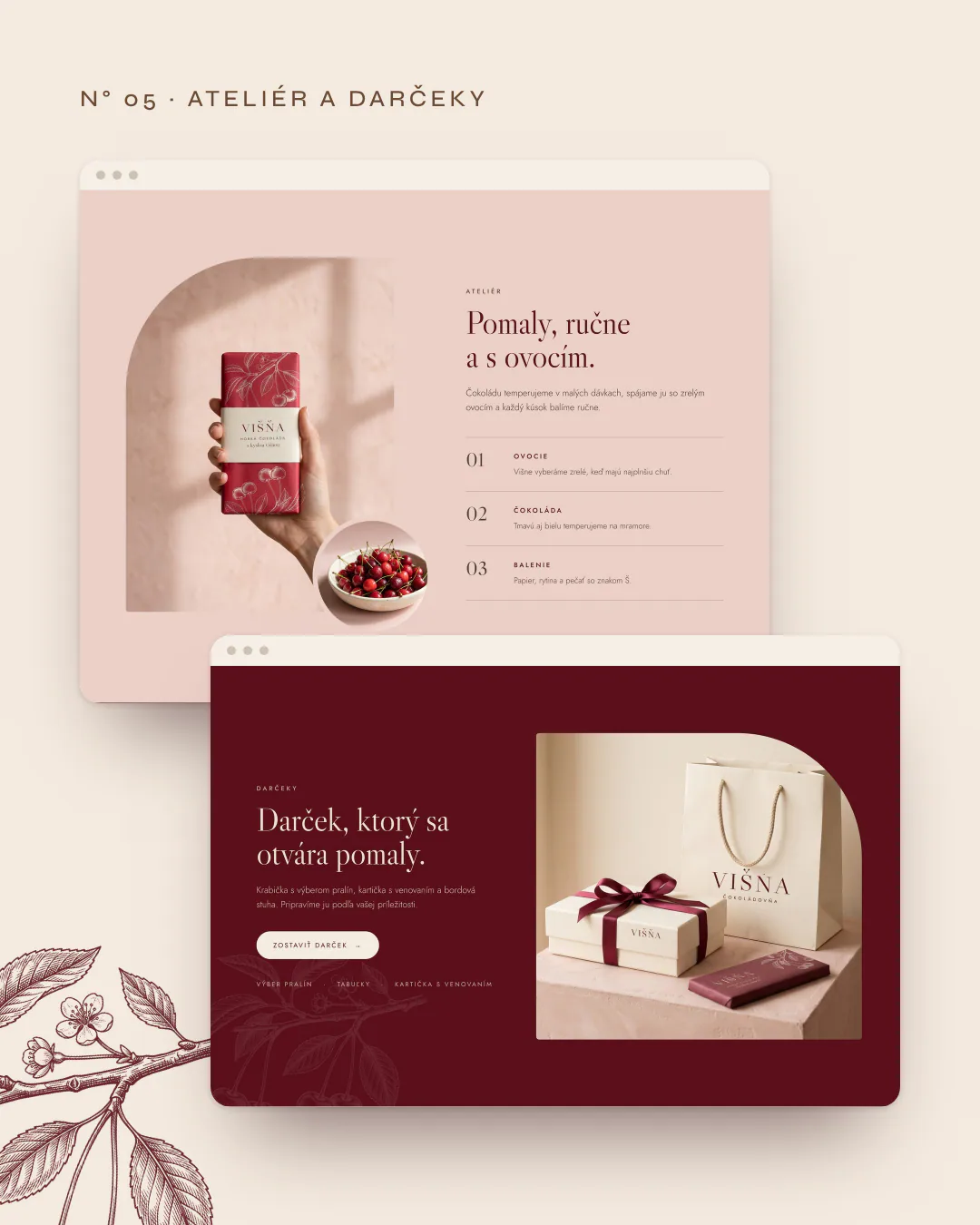
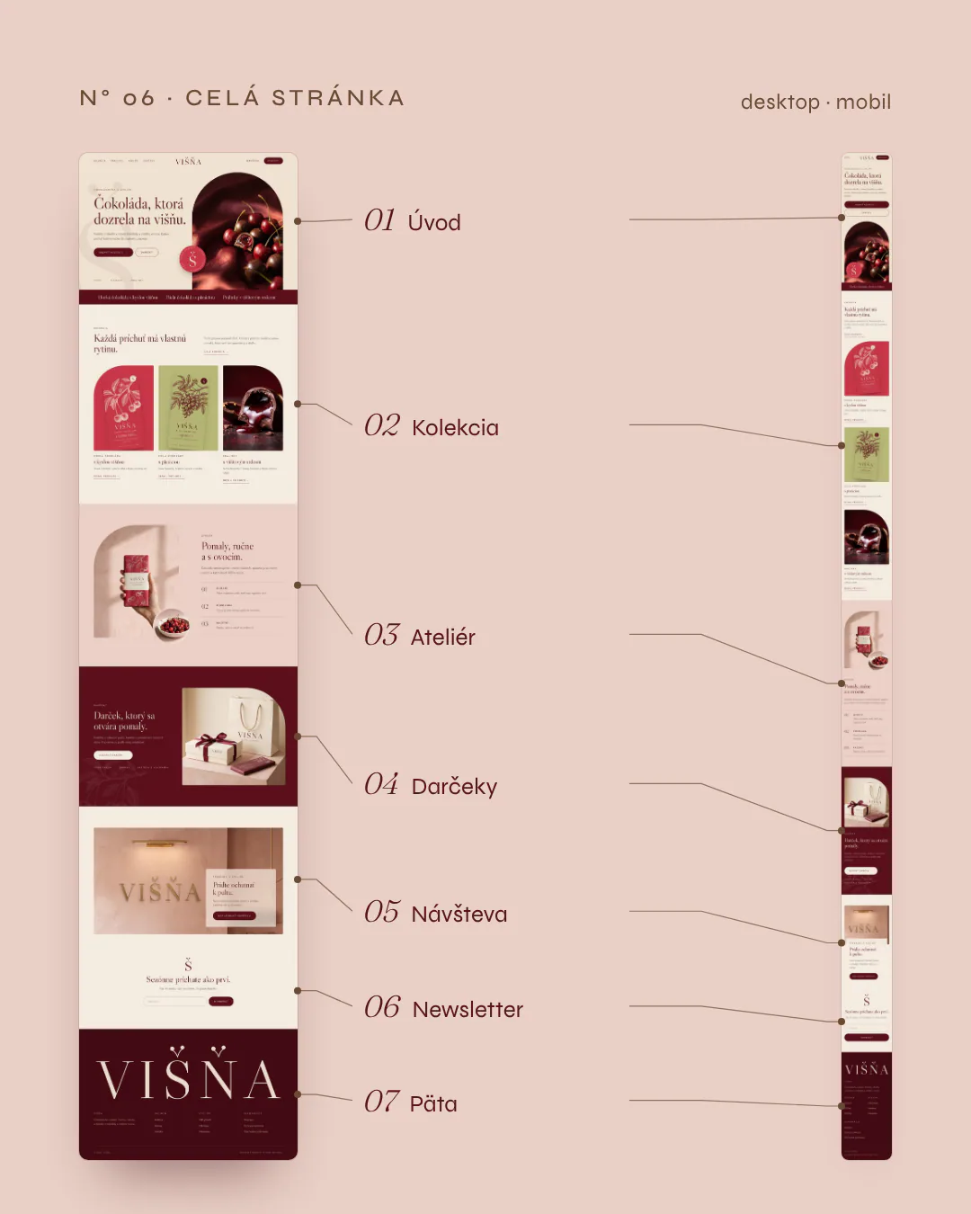
Intro, collection, atelier, gifts, a shop visit and the mobile version. Product cards take the paper colour of their packaging.
- 05
Packaging and print visualisations
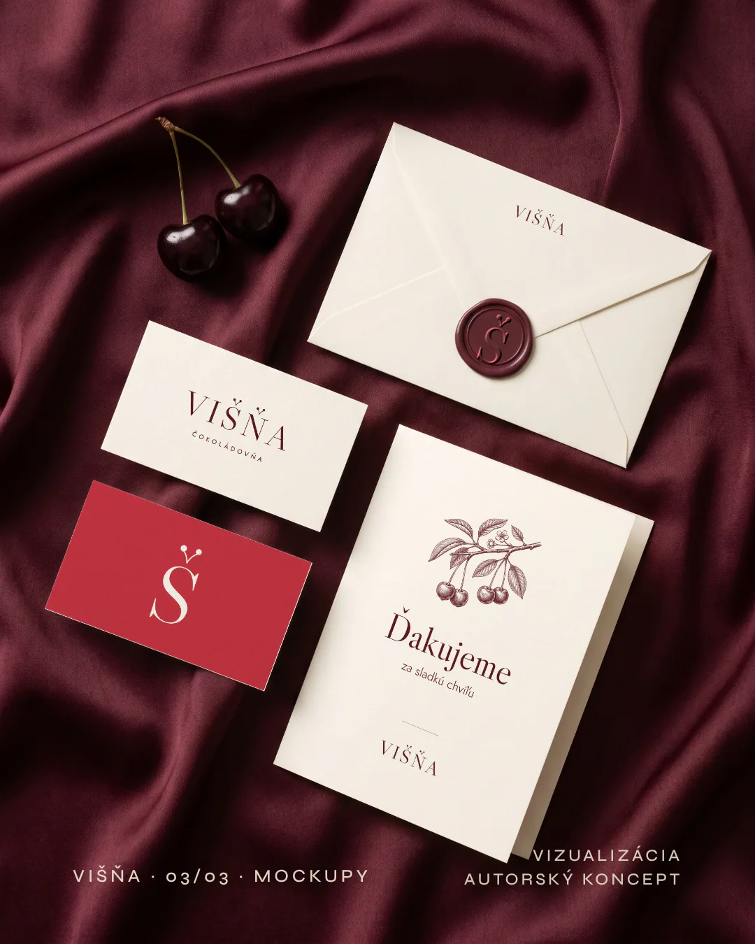
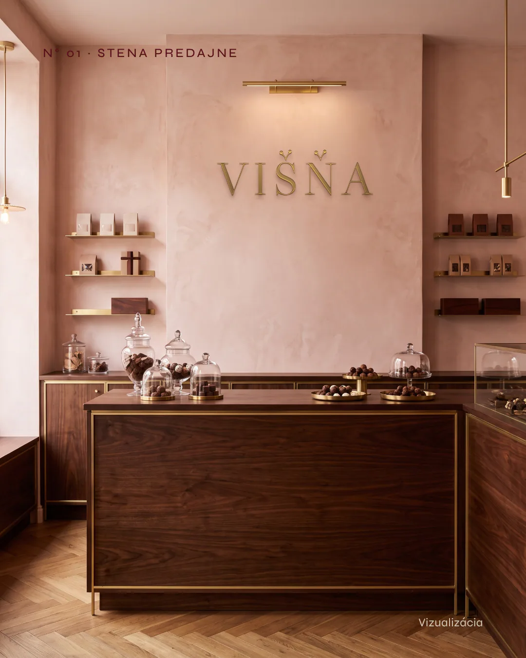
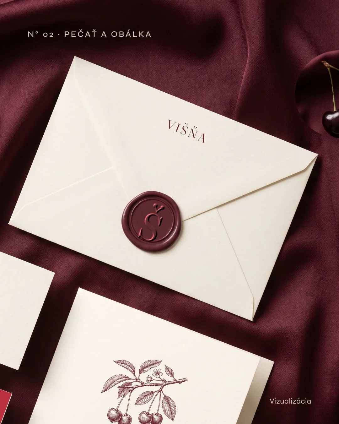
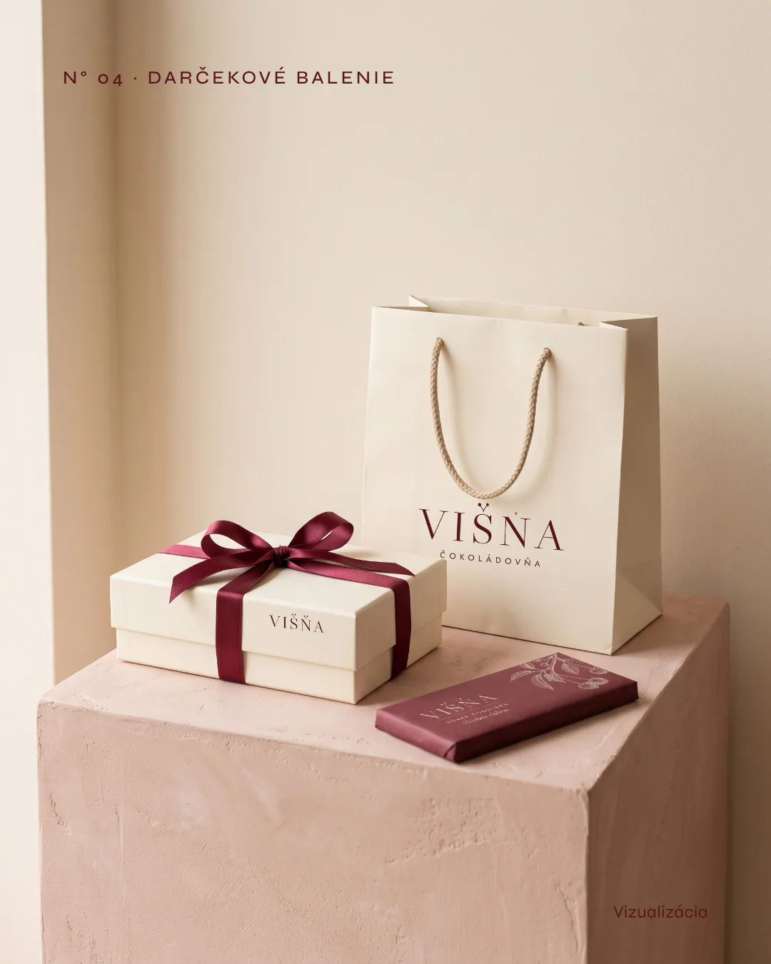
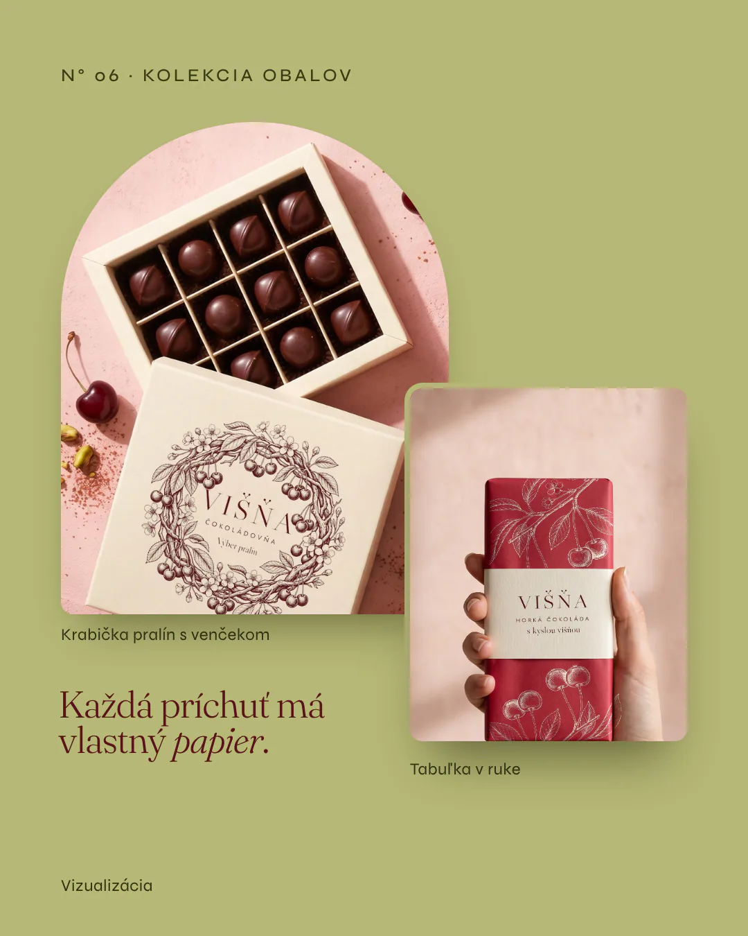
Business cards, a seal and envelope, a brass logo on the shop wall, a bag, a gift box with ribbon and bars wrapped in paper by flavour.
Next step
Tell us where you want to go. We will plan the route together.
The first consultation is free and without obligation. We go through your goals, and afterwards you receive a proposed solution with an indicative price.