
Longevity & regenerative health
WEIDE
Brand identity for longevity and regenerative health: a W monogram with a willow leaf, a seal, four colours, typography and visualisations of brand applications and the website.
Context
Weide is German for willow, a tree that grows again from a single twig and bends in a storm without breaking. The whole identity grows from this word. The brand applications and the website on this page are visualisations.
Goal
To create a calm, premium identity with one language across space, textiles, print and the web.
What we created
- 01
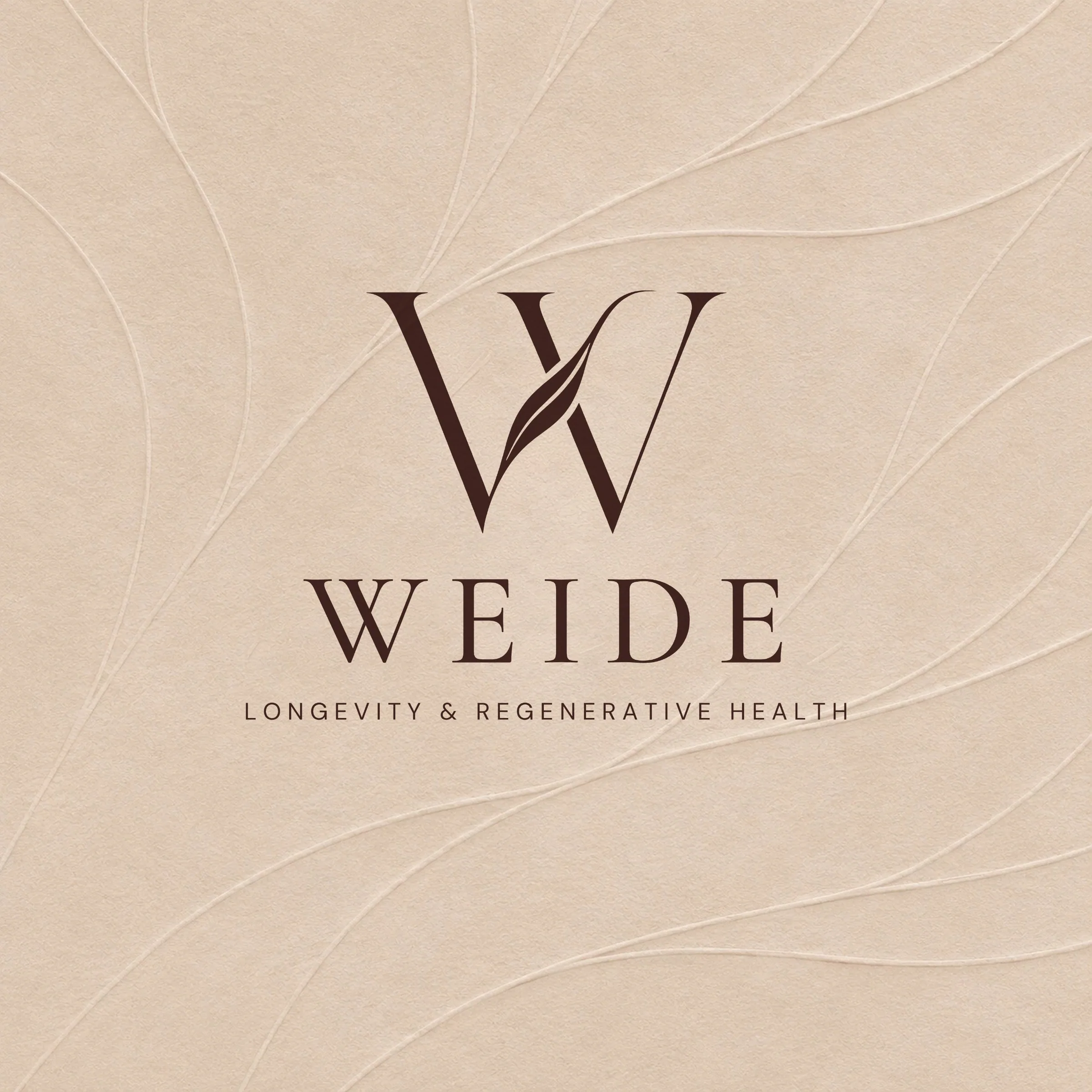
Logo system
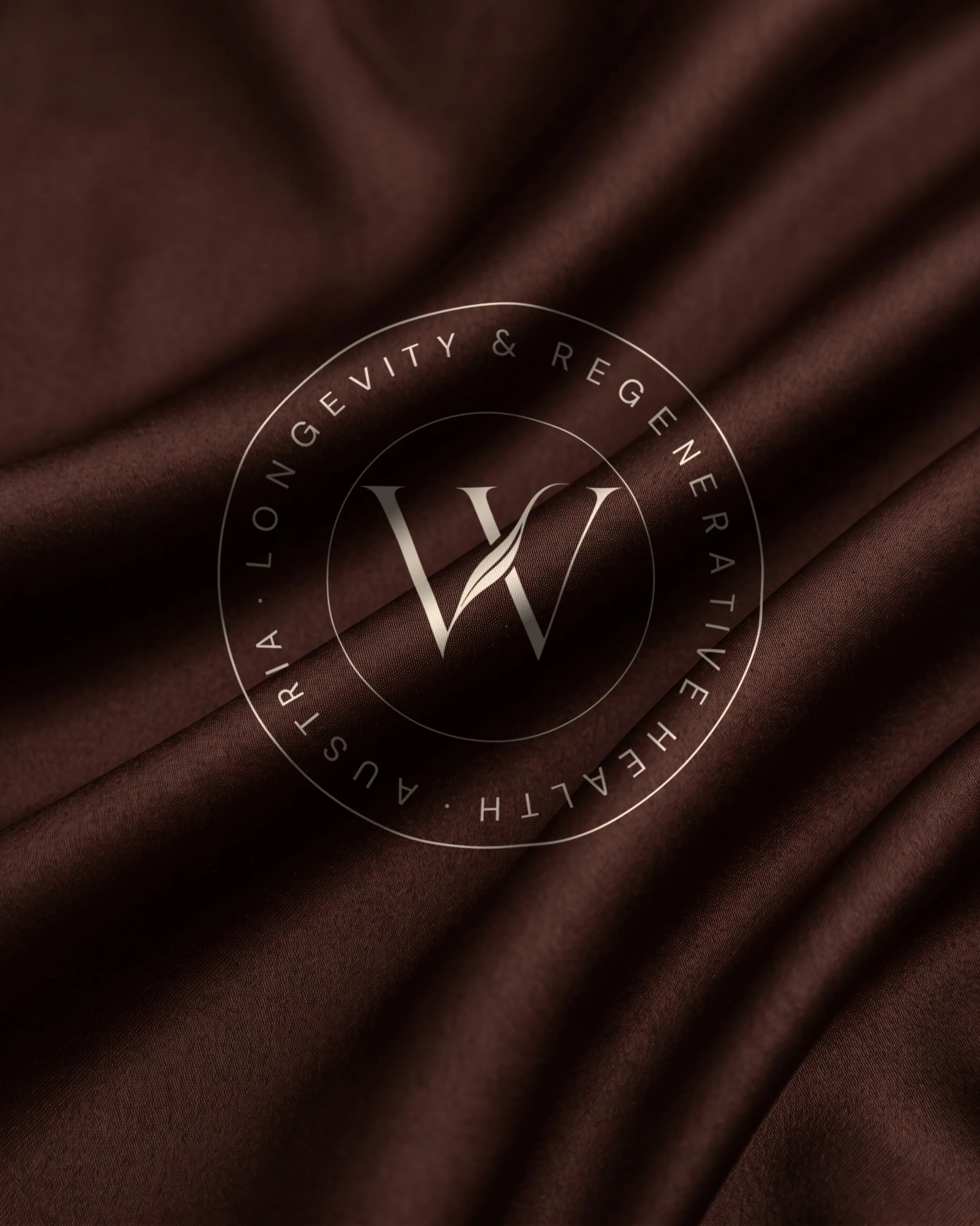
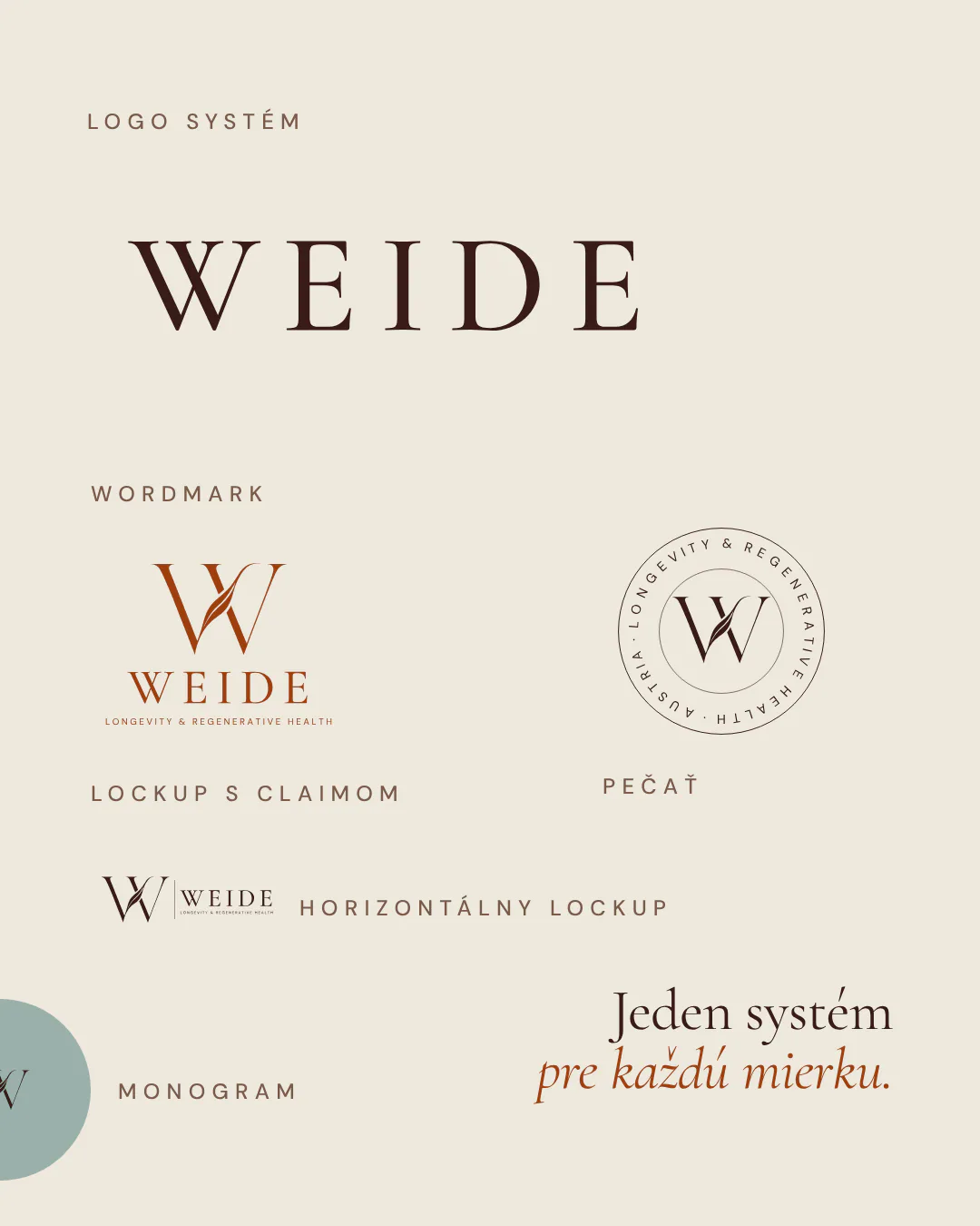
WEIDE wordmark, a W monogram with a willow leaf, a seal reading Longevity & Regenerative Health and lockups for large and small formats.
- 02
Colours
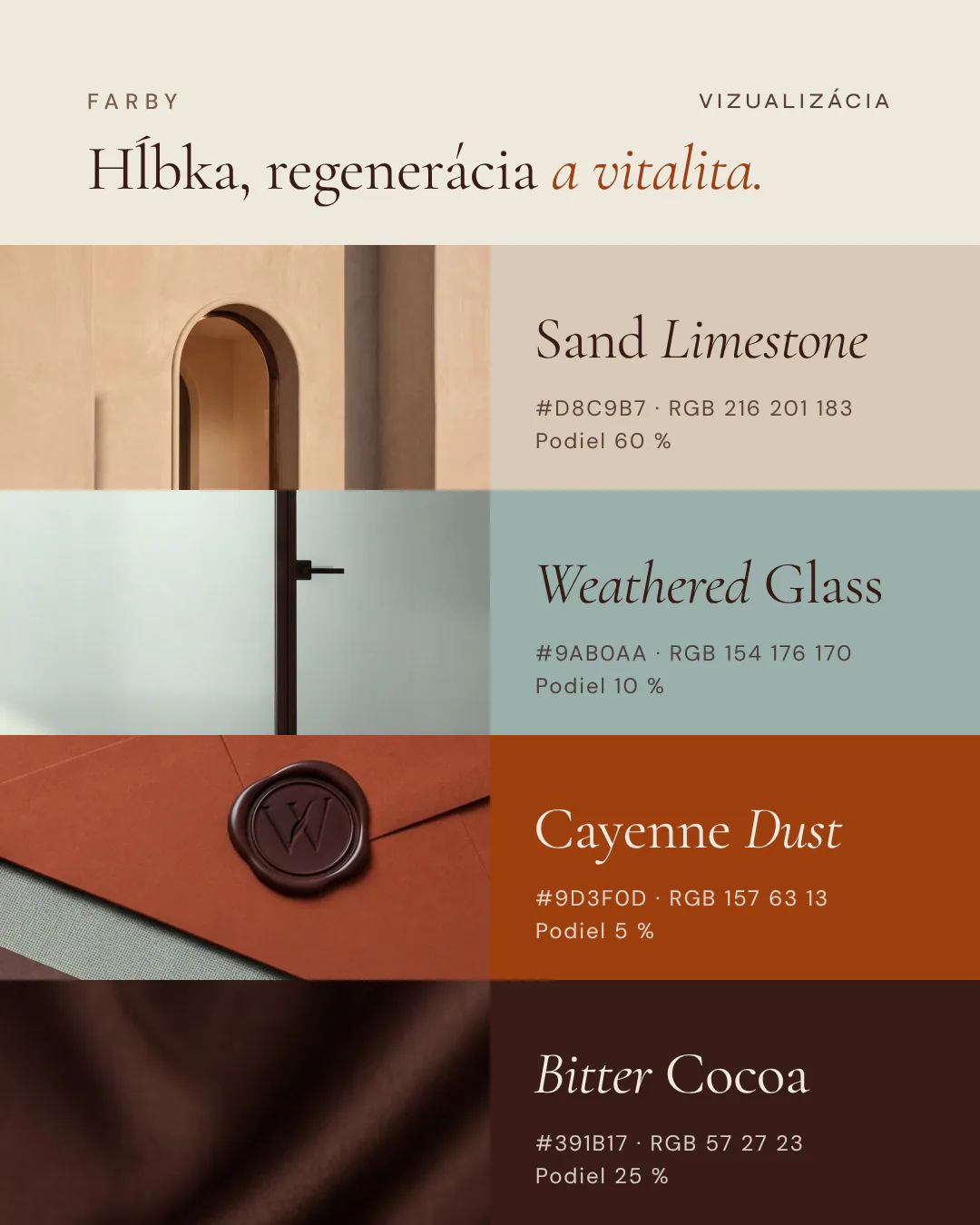
Four colours drawn from cocoa, spice, glass and limestone: Bitter Cocoa, Cayenne Dust, Weathered Glass and Sand Limestone.
- 03
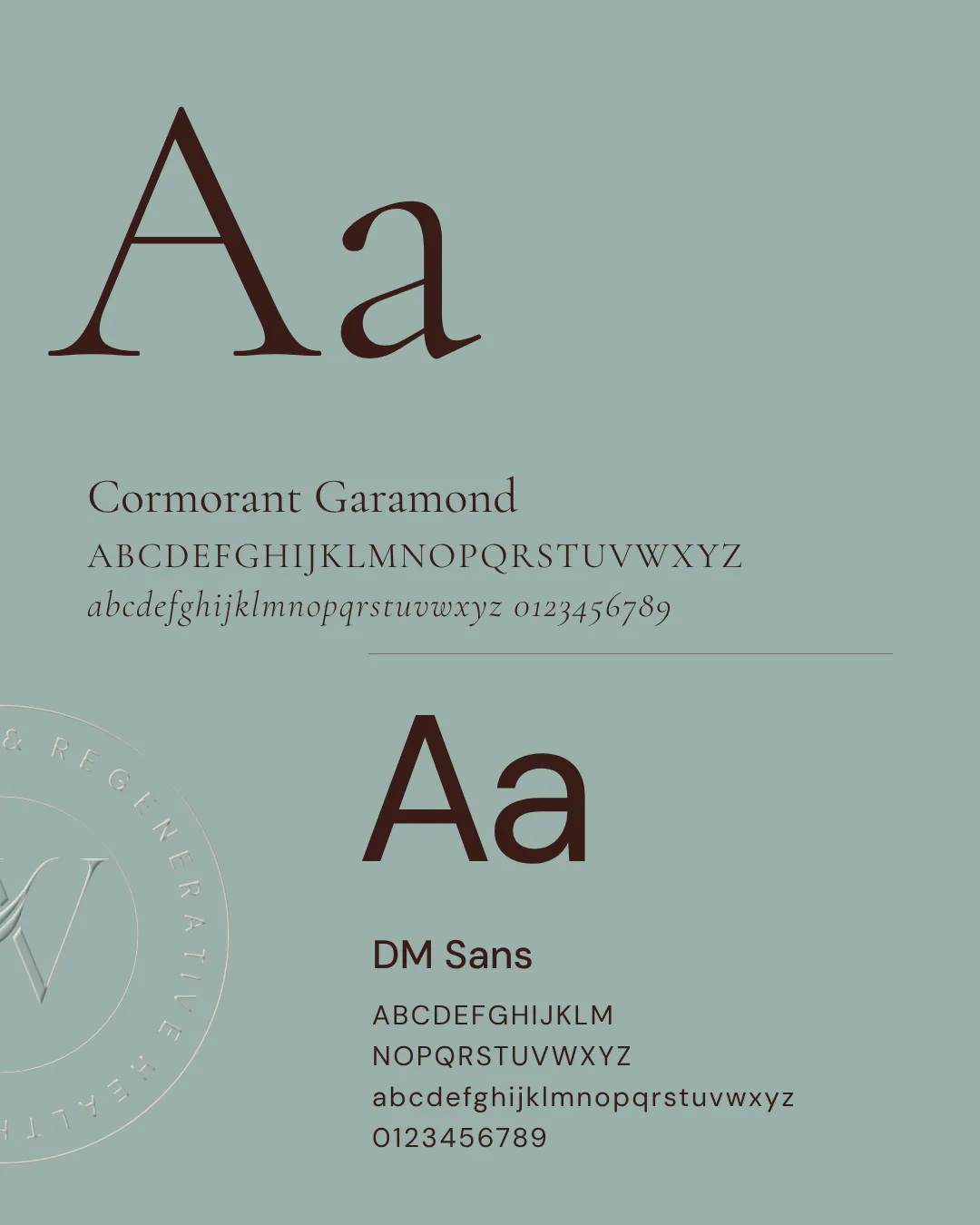
Typography
Cormorant Garamond for headings and DM Sans for text.
- 04
Brand application visualisations
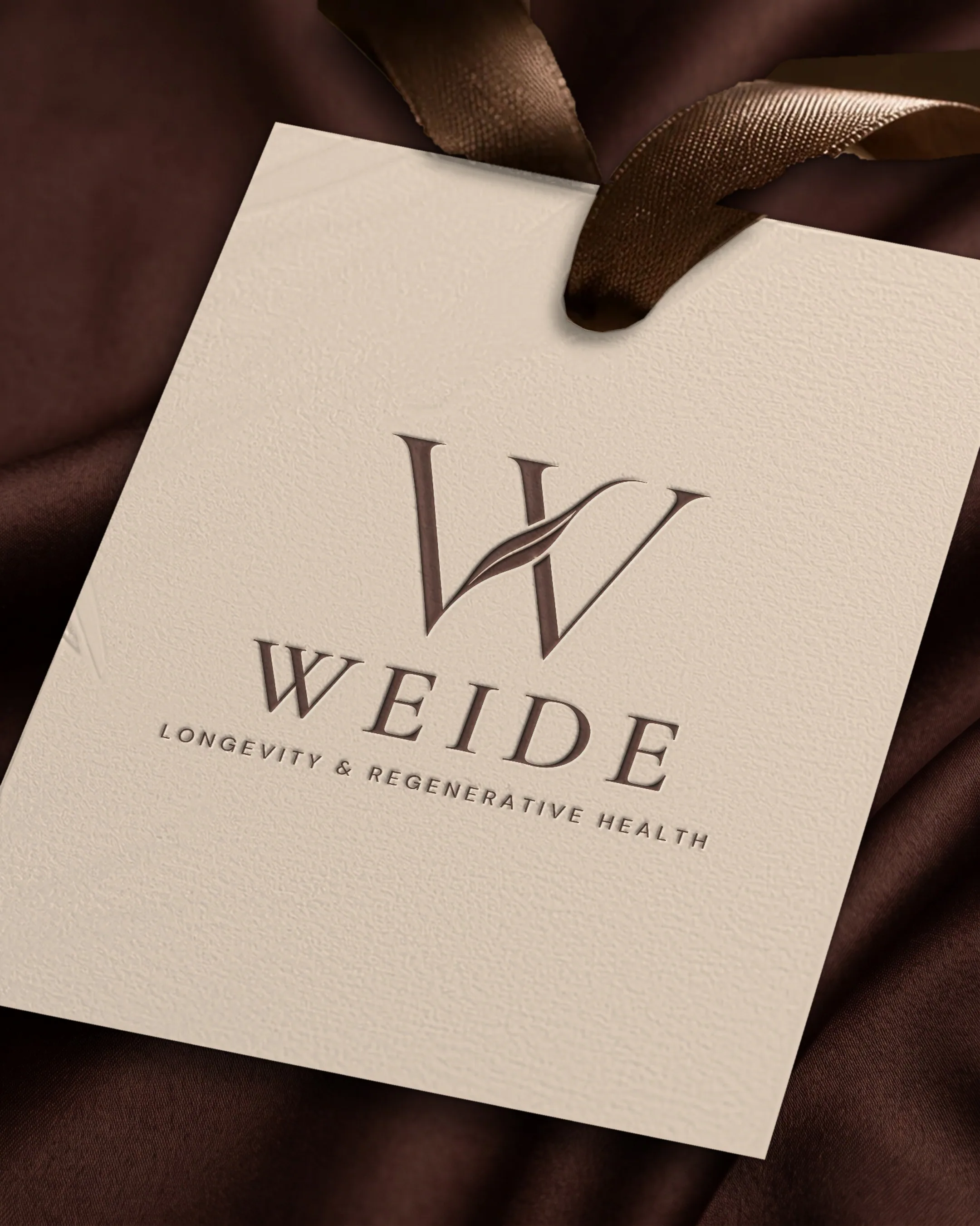
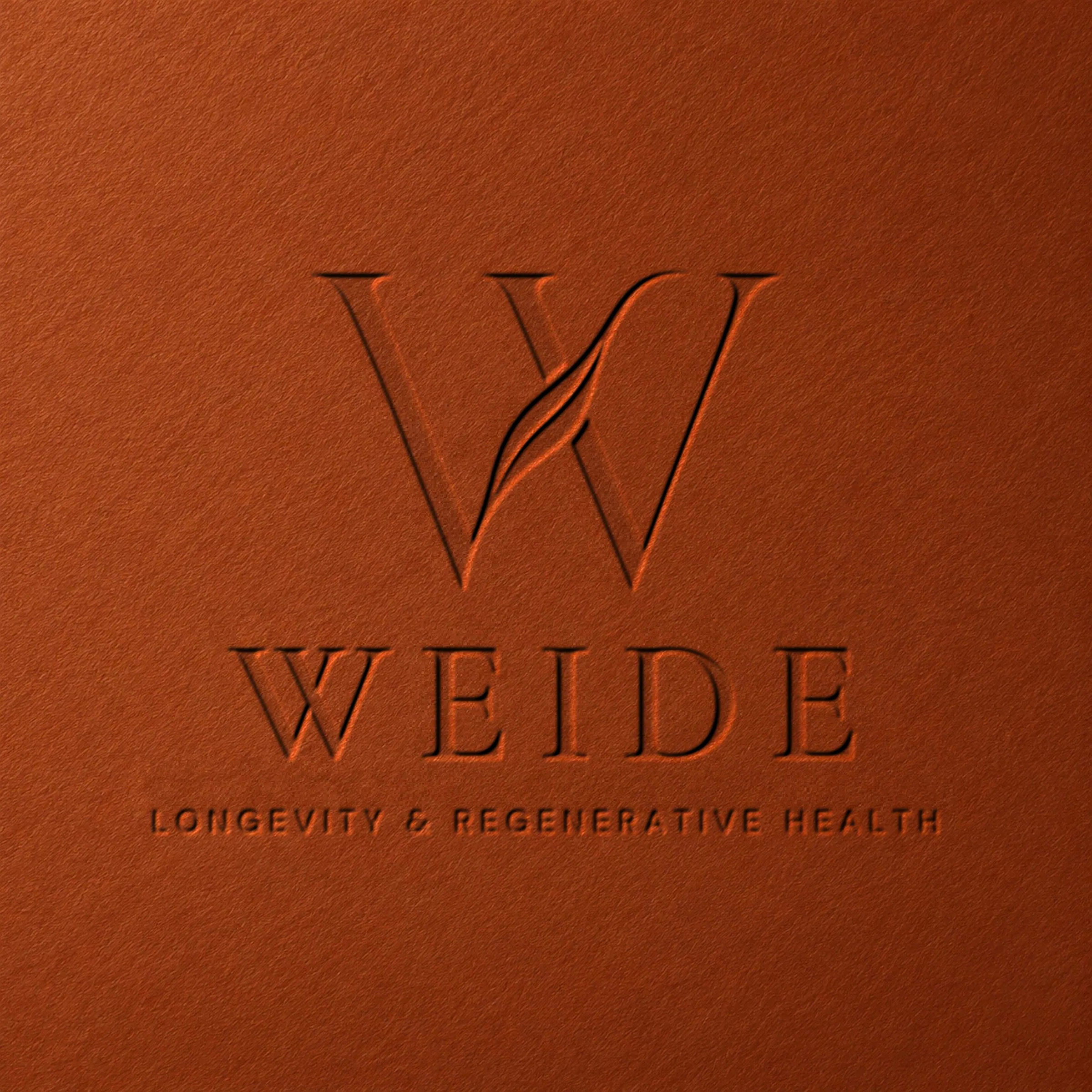
The seal on satin, a tag on silk and blind embossing on paper and terracotta board.
- 05
Website visualisation
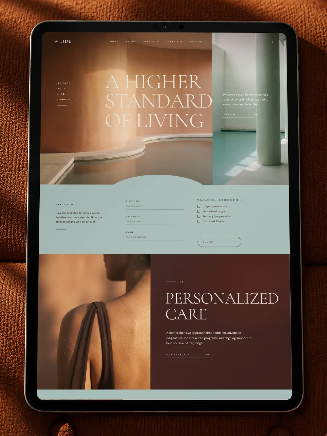
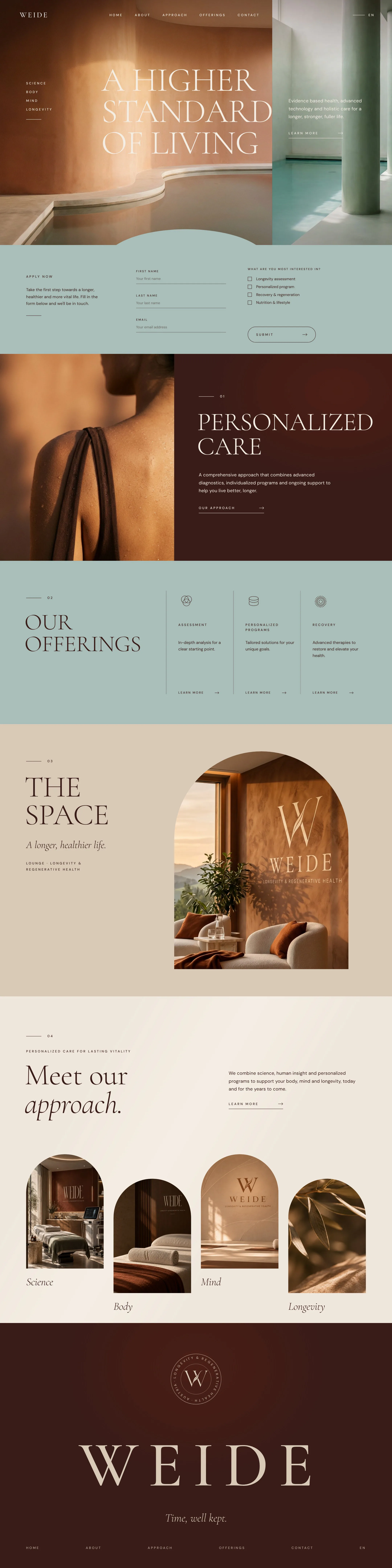
A website with an intro, a form and sections for personalized care, offerings, the space and the approach in arches, with scroll animations on desktop and mobile.
Next step
Tell us where you want to go. We will plan the route together.
The first consultation is free and without obligation. We go through your goals, and afterwards you receive a proposed solution with an indicative price.